Do you ever wonder why some people have a knack for picking the right colors? If you’re not one of those people, knowing a little about color theory can help. And even if you’re great at putting together a color scheme, it can be fun to learn about the logic behind how colors work together. Below is a primer on the basics of color theory, to make picking out colors even more fun!
What is Color Theory?
Color theory is the art and science of color. It can get complicated, but fortunately, even the basics can go a long way. Take this picture, for instance:
On the left is the color scheme, and on the right is that same scheme transformed into a fabulous bedroom! How did the designer know how to put them together? With a little help from the color wheel.
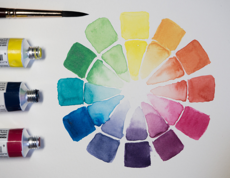
The Color Wheel
Color wheels look pretty, but they can also help you pick colors. All the primary, secondary, and tertiary colors are arranged in a wheel according to how they’re mixed:
The best color schemes use colors that have some relation to each other on the color wheel. Below, we’ll cover a few of the more popular schemes. If you want a cheat sheet, you can use the interactive color wheels on sites like Canva and Paletton to follow along and find your own favourites!
Complementary Color Scheme
This is when you choose direct opposites on the color wheel—red and green, for example, or orange and blue—to be the main colors in your palette. Complementary colors naturally contrast each other, making both colors pop:
However, complementary color schemes can also be jarring, especially when you’re using two bright hues. To make complementary colors harmonize a little better, try mixing up the shades of one or both colors.
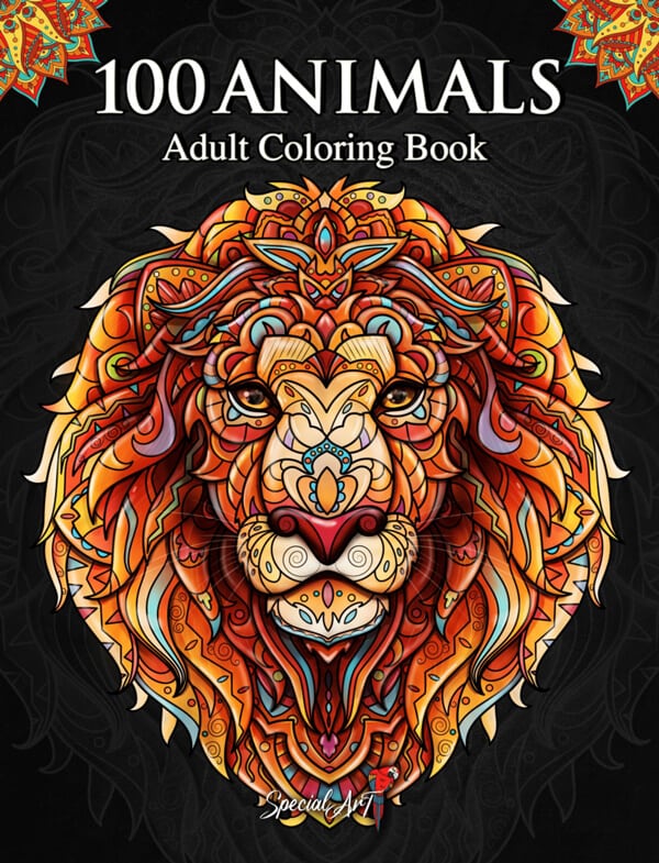
Example from our adult colouring pages: on the cover of our “100 Animals” coloring book, our designer has chosen a complementary color scheme with a variety of oranges as the main color, with subtle blue accents.
Monochromatic Color Scheme
A monochromatic color scheme uses varying shades of one color on the color wheel. It might sound boring, but it can actually create a really beautiful picture. Monochromatic schemes often evoke a strong mood:
The trick to getting them right is to use different variations of the same color, from the lightest to the darkest version. That way, there will still be enough contrast to make the palette interesting.
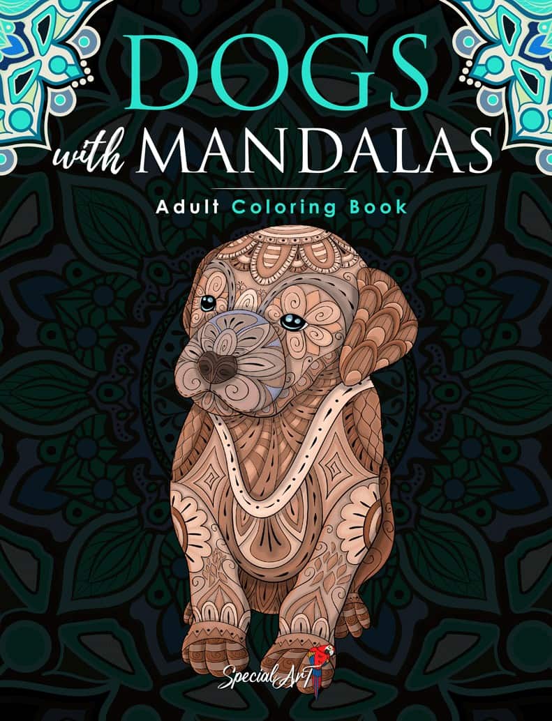
Example from our adult colouring books: our “Dogs with Mandalas” cover is mostly a monochromatic color scheme – with the exception of a complementary green to make its eyes stand out!
Analagous Color Scheme
In an analogous color scheme, you use colors next to each other on the color wheel. It’s a great happy medium between the harmony of a monochromatic scheme and the boldness of a complementary scheme:
When in doubt with an analogous color scheme, use a trick from designers: the 60-30-10 rule. Choose one color as a main color, taking up 60% of your composition. The second color should take up 30%, and the third, or accent color, takes up 10%.
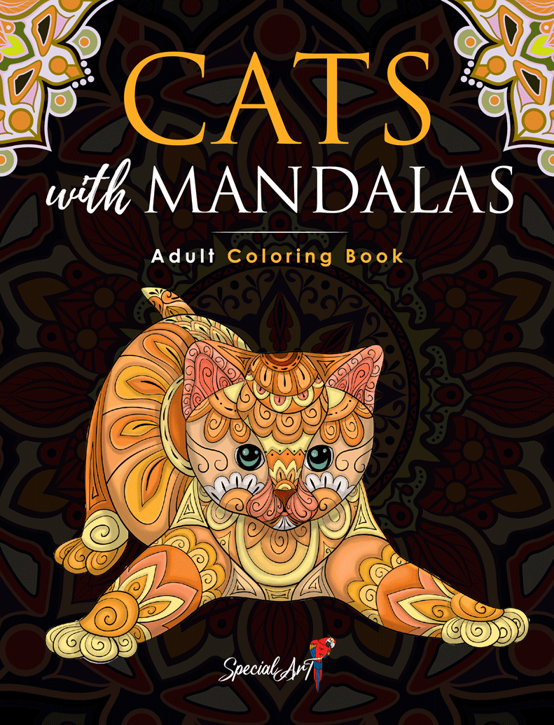
Example from our adult colouring books: our “Cats with Mandalas” cover has an analogous color scheme, with yellow, yellow-orange, and orange-red as its main colors. Again, the eyes and whiskers are an exception!
Triadic Color Scheme
A triadic color scheme is similar to a complementary color scheme, in that it leaves you with a bold palette of colors. In this scheme, you use three colors that are evenly spaced apart on the color wheel:
These color combos are great for creating a vibrant, playful feel. However, like complementary colors, they can be too much if all three of them are bright. Try using varying shades of each color, with the brightest shades as accents.
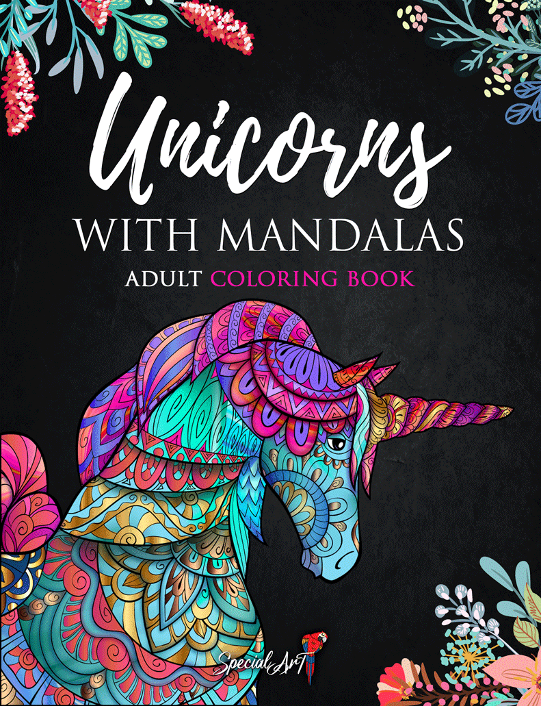
Example from our adult colouring books: our “Unicorns with Mandalas” cover has a triadic color scheme, with bright blues, pinks, and greens that dominate the composition.